Polished Design
One of our primary objectives was to carry the project into a polished state. We wanted to create a functional plant watering and notification system, and additionally, develop a product that a student would want to have in their dorm room. The interaction design was a constant and central piece in decision making throughout the project.
Graphics (LOGO)
We went through much iteration when creating the logo. The first step was in choosing the font type and lettering of the logo. We used dafont.com in order to create mock-ups that we could compare side-to-side. Over 25 mock-ups were generated, narrowed down to seven final choices, from which we selected Geo Sans Light as the final font face.
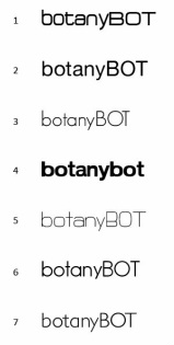
Figure 3. Final font face choices for the botanyBOT logo.
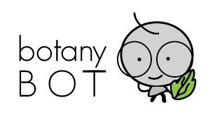
The next step was to create the face of our brand. We wanted to create a friendly but obviously plant-related robot. Early in the sketching phase, we decided to have a robot whose hands were in the shape of leaves. We started here:
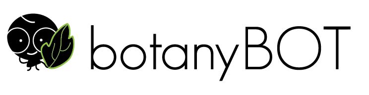
The first “robot” was cute, so we played around with colors and orientation of the character and the font faces.
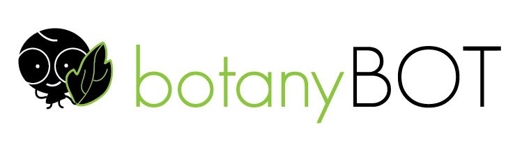
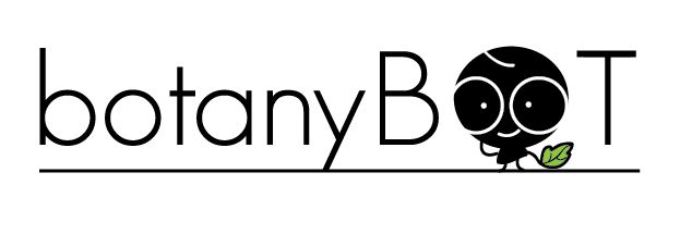
Playing around with colors led to logos that were becoming too complex. At the same time, we had ideas for using the robots head as the O in the log and experimented further.
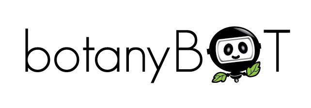
Though this first robot was “cute,” we realized it was not a “robot,” so redrew the robot. This one was too scary.
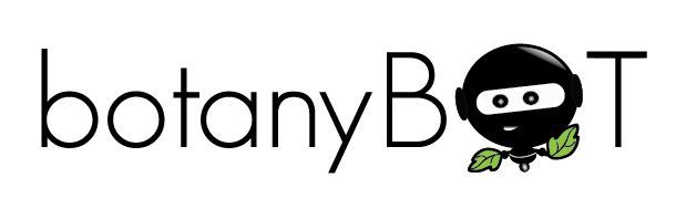
This one was a ninja not a robot
This one was a panda in a space suit. (Note: this was our low point).
So for a while, we quit on the robot idea, and tried making a simple logo.
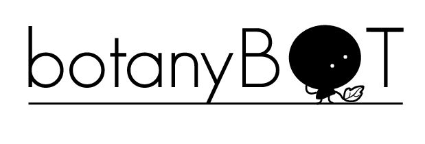
Which was too boring. So we started completely over, a new blank page in Illustrator, and in that first re-try, created the final logo.

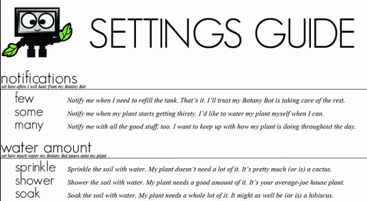
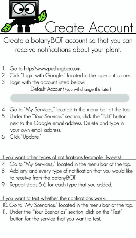
User Manuals
As part of thinking through the interaction design, we also thought through the user’s first run experience. What would they need when they opened the product and were setting it up the first time. We decided to include two user manuals. One for setting the controls on the botanyBOT front panel and a second for creating an account through which they could receive notifications from the botanyBOT.
As part of thinking through the interaction design, we also thought through the user’s first run experience. What would they need when they opened the product and were setting it up the first time. We decided to include two user manuals. One for setting the controls on the botanyBOT front panel and a second for creating an account through which they could receive notifications from the botanyBOT.